Heat Island Effect means that temperatures across a city can vary widely due to differences in development, greenspace, transportation networks, and other factors.
A Deceleration analysis shows that greater downtown San Antonio and the northwest zone, including the Medical District, are bearing the brunt of rising heat—as are those already suffering energy burden and asthma on the west and east sides of town.
San Antonio is still crawling out of what is almost certain to go down as our most punishing summer on record. One thing is clear: Not everyone experienced the heat equally. Access to resources—air conditioning, insulated homes, money to pay for movie tickets, or access to a car or bus service, for example—impacted how people lived through the weeks of 100-plus temperatures. But even if all of these things were equal, place matters. Thanks to something known as the Heat Island Effect, even the heat itself is not spread equally around the city, as demonstrated by data released recently by Greenlink Analytics and mapped for Bexar County by Deceleration. Lack of trees, density of buildings, amount of concrete, large buildings that change wind flow, and busy roadways, all of these influence the distribution of heat in a city.
Bexar County’s average Urban Heat Intensity (UHI) score is 6.1, according to Greenlink data. But those living in the urban core of the city and the heavily developed northwest zone along I-10 and the Medical Center District appear to be living with more than their fair share of heat.
The Government Hill area, for instance, just to the northeast of downtown and adjacent to Fort Sam Houston, scored a 10—the hottest rating for all Census tracts and significantly hotter than much of the rest of Bexar County. Downtown proper, by comparison, ranked 9.7. And the near Westside scored 9.3. The Census tract containing Brackenridge Park rated 8.6, while just up-gradient in Alamo Heights, the rating dropped further to 6.2 UHI. On the whole, less developed areas scored lower Urban Heat Intensity scores.
Up I-10 are some of San Antonio’s hottest Census tracts. The dense apartment blocks just above the Medical Center area, including AXIO, Riverstone, and Wolf Run apartments, tie Government Hill with a perfect 10 Urban Heat Intensity rating. The South Texas Medical Center complex just to the south bakes with a 9.8 Urban Heat Intensity rating. At the fringes of the city, however, things cool off. Traveling west to east at Southside Lions Park on the Eastside, for instance, one sees a rapid drop off from 7.1 UHI to 4.2 UHI.
Compounding sites of overlapping health inequities are also visible around the city, as demonstrated in the maps below. The neighborhood around the Alazan Apache Courts on the near Westside scores toward the top for heat island (9.3), income stress (9.56), asthma rates (11.4 percent), and lack of internet connectivity. A daunting collision of very high asthma rates (11.1 percent) and high heat island ranking (9.8 UHI) meets in the Eastside around Harvard Place just west of the AT&T Center.
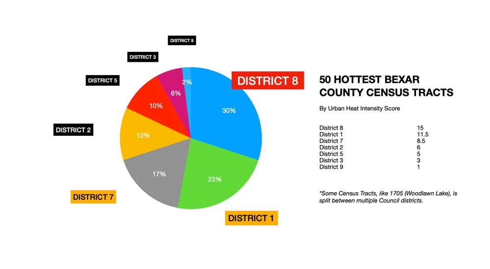
Breaking down along political boundaries, we found that 11 of the hottest 20 Census tracts are in District 8; three are District 1; three in District 7, and three in District 2. Four Census tracts tied as the hottest in Bexar County.
Greenlink’s data is derived from nighttime satellite imagery collected during the hottest months of the year (May through August) and intended to help understand the diversity of temperatures found within nearly 380 of the largest US metro areas. The resolution of this mapping platform is one square kilometer. Greenlink does not map temperatures—only the range of temperature difference in a city. But recent research examining decades of heat island temperatures shows that downtown San Antonio can be up to 14 degrees Fahrenheit hotter than the average area temperature and up to 21 degrees Fahrenheit higher than surrounding rural areas.
Deceleration was trained by Greenlink to utilize their platform. Last year, Deceleration mapped the relative energy burden of Bexar County residents. Energy burden is defined as the percentage of annual household income that residents pay for electric, gas, and water utilities (See: San Antonio’s Five Most ‘Energy Burdened’ Neighborhoods). We found considerable overlap between areas with high energy burden and high heat island.
Many of residents of the most energy-burdened neighborhoods, most conspicuously on the near Westside, also inhabit areas with high Urban Heat Intensity scores. Phrased another way: Many who are suffering artificially generated high temperatures—largely, but not exclusively, because of differences in local development patterns—are also paying far more for the utilities that are required to cool them down. A double whammy.
Greenlink used June data for Bexar County to generate its heat intensity scoring system to be able to compare neighborhood to neighborhood. June was determined to offer the best data to demonstrate heat and electricity consumption, Matt Cox, CEO at Greenlink, told Deceleration.
“This data can help inform policies that reduce heat islands and alleviate the cascade of burdens that accompany extreme heat, such high energy burden and asthma rates, making life harder to handle and bear,” said Sharanya Madhavan, lead data scientist for Greenlink’s UHI project. “By looking at different temperatures, we can better understand the urban heat island effect, identify the neighborhoods disproportionately affected by heat, and begin to see the relationship between heat and other burdens.”


